WebNMS’s web client UI is now packed with advanced features and data visualization
Steep increase in network devices, growing service complexity, challenges as a result of visualization and demand for mobility has greatly impacted the telecom networking terrain. The constantly growing complex networks today demand network engineers to analyze and draw insights from large data sets. Is your network management system simplifying this task for you?
With highly effective data visualization techniques and many usability focused features, WebNMS now offers an intuitive & insights driven user interface to meet the needs of the current network management scenario. With dynamic updates, personalized dashboards, KPI Reports and great data visualisation it is now much simpler to comprehend data.
These are some of the recently added GUI features that will enable you to manage your network more effortlessly:
Dynamically Updated Data
The usability focused graphical user interface provides you intelligence data about any changes in network/device status and updates the alarms as the event occurs. Now you no longer need to refresh/wait to get the updates. It is available to you instantly. You could even assign an audio notification for the alarms that are most crucial to you.
KPI Scorecard
The KPI Scorecard is just the feature you needed to analyse your network’s performance. Now simply define the Key Performance Indicators for your business and be able to track if your average fault resolution time has improved or even detect the vendors whose devices are more faulty. With the KPI Scorecard, you can quickly & easily define your key performance indicators and track & analyze the metrics most important to you.
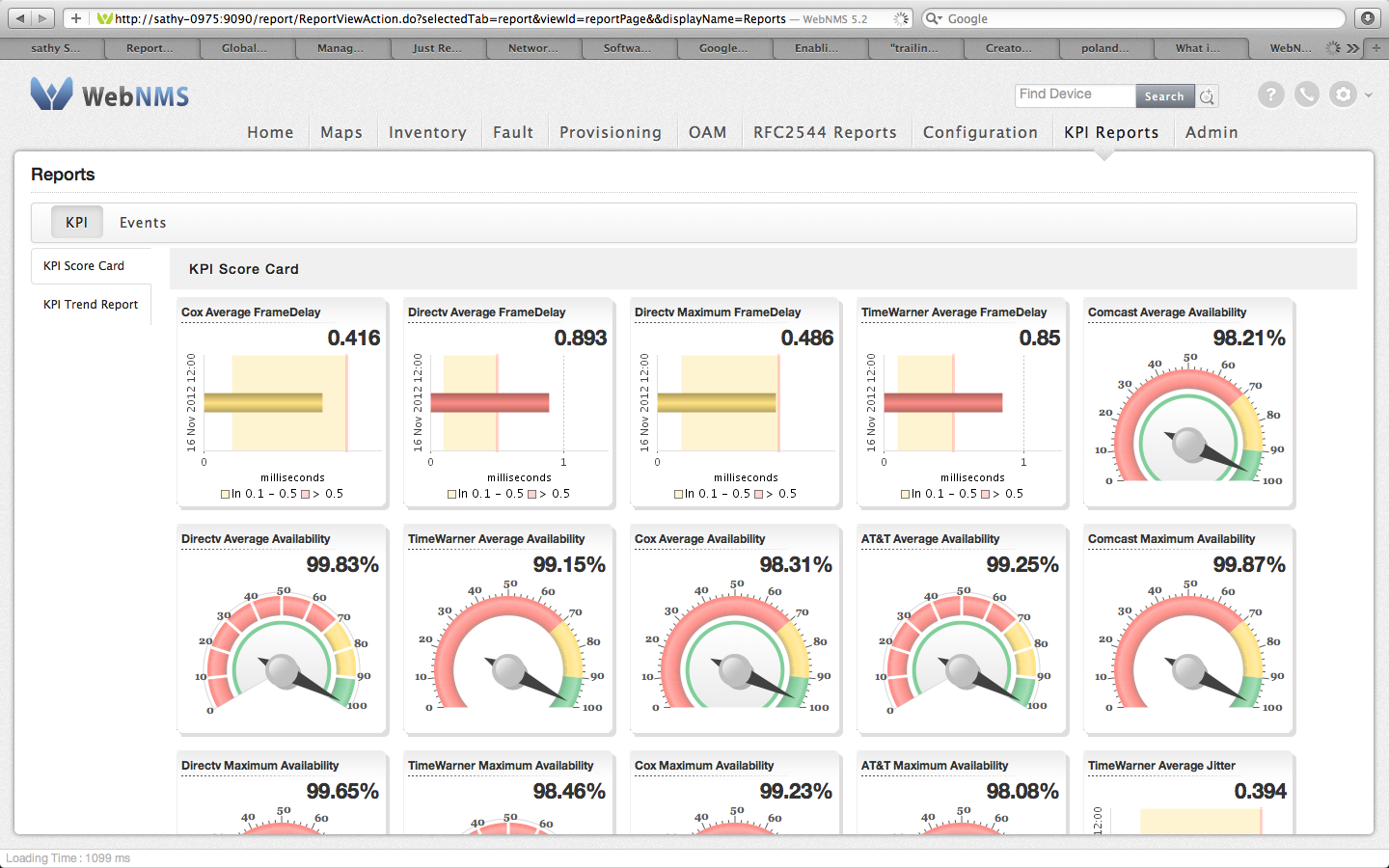
KPI Scorecard
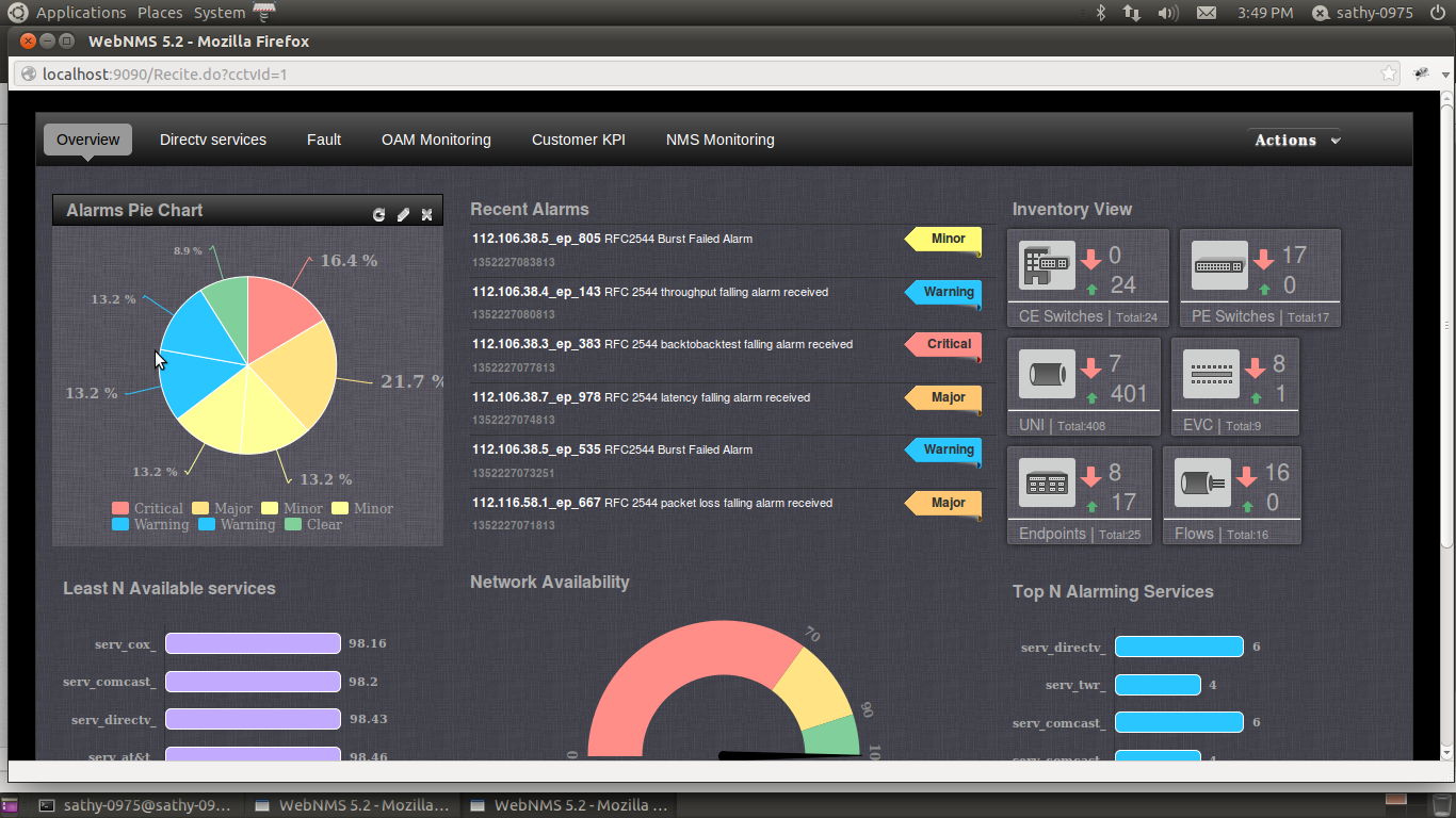
Build your own Personalised Dashboards
Dashboards today are critical to the management of complex information environment of networks today. With WebNMS Dashboard, view performance information in a graphical format and quickly identify and analyze performance issues. Simply use the drag & drop feature and within seconds build your own dashboard with metrics that are most essential to you. You can now pick what you want to see in the dashboard and even choose to build multiple dashboards.
On the move? Track it on your tablets!
The WebNMS web access allows you to access the network monitoring environment from any location. Our flexible and device agnostic user interface enables easy viewing even on the move with handhelds & tablets.
Enhanced Usability & Dark Theme
With WebNMS you have a clutter-free, simple and easy to navigate User Interface with visually expressive reports. WebNMS provides you the option to choose between the light & dark themes to suit your requirement. The enhanced visibility with the dark theme is a real value addition especially for the NOC Center agents.
Dark Theme for NOC Center Viewing
Request for a demo and experience the usability focused UI that makes WebNMS even more easy to use, the first time you get your hands on it!